
Bitcoin UX patterns
This is a review draft of a self-guided intro course for Plan ₿ Academy, not a permanent Guide page. Erik and Christoph asked that the course live on their platform so they can teach it as part of the program. The write-up is here so the Design Guide community can review the content first.
Plan ₿ Academy courses are markdown chapters with images and a per-chapter quiz. Video is a separate resource type. This draft follows that format: written explainers, wrong-way vs. right-way comparisons, and a short quiz at the end of each chapter.
Expect about 45–90 minutes. Each chapter pulls from existing Guide pages rather than inventing new advice.
How this course is structured
Two parts, five chapters:
- Foundations — why bitcoin UX is different, and which principles show up in the interface
- Patterns — confirming a manual backup, formatting addresses, and presenting fees
This is not a tour of how to navigate the Guide. You are here to learn specific interface decisions that show up in wallets, and why one version is safer or easier than another.
Source material
Every pattern below links back to the Guide page it is based on. If you want the full treatment after a chapter, follow those links.
Part 1: Foundations
Why bitcoin UX is different
Read the full argument on Why design for bitcoin.
Bitcoin products ask people to hold money without a bank in the middle. There is no customer-support team that can reverse a payment or reset a forgotten password. That changes what “good design” means.
In a typical fintech app, a confusing backup flow is annoying. In a self-custodial bitcoin wallet, the same flow can mean permanent loss of funds. Irreversible transactions, public ledgers, and recovery phrases are not edge cases — they are the product.
You are not decorating an existing bank. You are designing how people send, spend, save, and recover money on an open network. Small interface choices (how an address is shown, whether a fee is visible, how a backup is confirmed) carry unusual weight.
What this means in practice
- Errors are expensive. Sending to the wrong address, or skipping a backup, is often unrecoverable.
- The user is the custodian. Copy that assumes “we can restore your account” is misleading.
- Interoperability is a feature. People move between wallets. Standards (recovery phrases, payment URIs, descriptors) are part of the UX, not just engineering.
Principles that show up in the UI
Read the full list on Design principles.
You do not need to memorize every principle to design a send screen. You do need to notice when an interface quietly fights them.
| Principle | How it shows up |
|---|---|
| Self-custody | Backup and recovery copy tells the truth: only the user can restore the wallet |
| Security | The app never asks the user to type a recovery phrase into a text field if tapping words will do |
| Transparency | Fees, confirmation times, and service charges are visible before the user commits |
| Interoperability | Payment requests and backups use documented formats other wallets can read |
| Privacy | Addresses are not reused by default; reuse is explained, not hidden |
The rest of this course looks at three patterns where those principles either hold or fail in a few pixels.
Check your understanding
1. Why is a confusing backup flow more serious in a self-custodial bitcoin wallet than in a typical bank app?
- A. Bitcoin wallets have stricter app-store review
- B. There is usually no intermediary who can restore access if the backup is wrong or missing
- C. Recovery phrases expire after 24 hours
- D. Bitcoin transactions always confirm in under a second
Answer
**B.** Self-custody means the user holds the keys. If they lose the backup, nobody else can reconstruct the wallet. That is the point of the [manual backup](/guide/how-it-works/private-key-management/manual-backup/) model — and why confirmation UX matters.2. Which interface choice best supports transparency?
- A. Hiding network fees until after the user hits Send
- B. Showing estimated cost and confirmation time before the user confirms
- C. Bundling all fees into the receive amount with no explanation
- D. Using the word “free” for lightning payments that still have routing fees
Answer
**B.** [Send fees](/guide/daily-spending-wallet/sending/send-fees/) should be visible and actionable before commit. Surprises after Send teach users not to trust the app.Part 2: Patterns
Confirming a manual backup
Read the full flow on Manual backup (daily spending wallet) and the scheme overview on Manual backup.
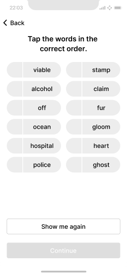
When a wallet shows a 12- or 24-word recovery phrase, the next screen should check that the user actually wrote it down. The cheap version of this check is a row of empty text fields. The better version is a scrambled list of the same words that the user taps in order.
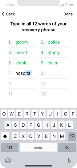
Typing every word:
- Invites typos, autocorrect, and screenshots of the keyboard
- Is slow and stressful on a phone
- Tests spelling more than “did you write this down somewhere you can read it back”
Tapping the words in order:
- Matches how people actually stored the phrase (numbered list on paper)
- Makes mistakes obvious immediately
- Avoids putting the secret through a general-purpose text field
Do
Prompt the user to tap the recovery-phrase words in the correct order. Number the words when you first display them, so confirmation is not a counting puzzle.
Don't
Ask the user to type the phrase into empty text fields. That is slower, more error-prone, and a poor test of whether they stored the backup.
Explain the verification step before you scramble the words. If they tap the wrong word, say so immediately — then let them continue from the last correct word rather than restarting from scratch when you can.
Remind them, once, that you cannot recover the phrase if they lose it. That is not scare copy. It is how self-custody works.
Check your understanding
1. Why is tapping recovery-phrase words in order better UX than typing them into input fields?
- A. It looks more modern
- B. It confirms the user can read the backup they wrote down, without typos, autocorrect, or extra keyboard exposure
- C. It lets the wallet store the phrase in iCloud automatically
- D. BIP 39 requires tap-to-confirm
Answer
**B.** The goal is to check that the backup exists and can be read back, not to re-enter a secret through a text field. See [Confirming a backup](/guide/daily-spending-wallet/backup-and-recovery/manual-backup/#confirming-a-backup).2. When you first show the recovery phrase, why number the words?
- A. So the phrase can be used as a PIN
- B. So later confirmation (“tap word 7”) does not force the user to count from the top of a blank list
- C. Because miners require numbered backups
- D. So the app can email word 1 through word 12 separately
Answer
**B.** Numbering at display time is a small courtesy that makes confirmation less painful. The Guide calls this out as a backup-flow tip.Address formatting
Read the full guidance on Address — visual formatting.
A bitcoin address is a long string. Transactions cannot be reversed. People compare addresses character by character when they paste, check a QR, or read a hardware-signer screen. Visual formatting is how you make that comparison possible.
Do
Use a monospaced typeface, group characters into even chunks, and offer a larger, well-spaced view when the compact version is too tight. Characters that look alike in proportional fonts (l / 1 / I) become easier to tell apart.
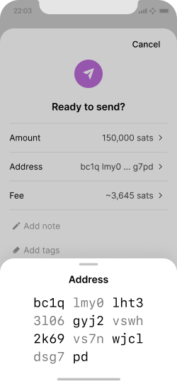
Give people a readable alternative when the compact address is hard to compare.
Don't
Render the full address in a proportional UI font as one unbroken line. That forces users to scan a dense block of similar-looking characters, which is exactly when mix-ups happen.
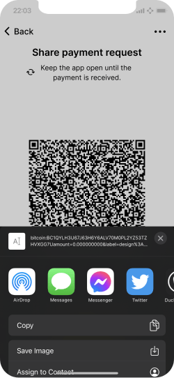
Bech32 addresses already drop some ambiguous characters. Your typeface should still distinguish the ones that remain. Source Code Pro and Fira Mono are the examples the Guide cites.
Validation can catch some typos. It cannot catch “this is a valid address that is not the one the user meant.” Formatting is still required.
Check your understanding
1. What is the main reason to display addresses in a monospaced font, split into chunks?
- A. It makes the address shorter
- B. It makes character-by-character comparison easier before an irreversible send
- C. It encrypts the address on screen
- D. It is required by BIP 321
Answer
**B.** Visual formatting exists so people can compare addresses accurately. It does not change the underlying format, and it does not replace validation.2. A user pastes an address with two characters swapped. The address is still valid. What should the UI have done to reduce that risk?
- A. Nothing — valid addresses are always correct
- B. Made the address easier to inspect (spacing, monospace, expanded view) and confirmed the send against what the user intended
- C. Silently rewrite the address to the last used one
- D. Convert every address to a lightning invoice automatically
Answer
**B.** Validity is not the same as “this is the intended payee.” Formatting and a clear confirm step are how you help the user catch the swap.Fee selection
Read the full guidance on Send fees.
Fees are not a settings-page detail. They are part of the send decision. On-chain, cost and confirmation time move with the mempool. On lightning, routing and service fees are usually small — until they are not, or until an LSP fee appears for the first time.
Give people a few urgency-based options (for example low / medium / high), each with a total cost and an estimated confirmation time. Offer a custom path for power users. Warn them when the fee is a large share of the amount they are sending.
Do
Show fee options framed by urgency, with total cost and expected confirmation time. Warn when the fee is high relative to the payment.
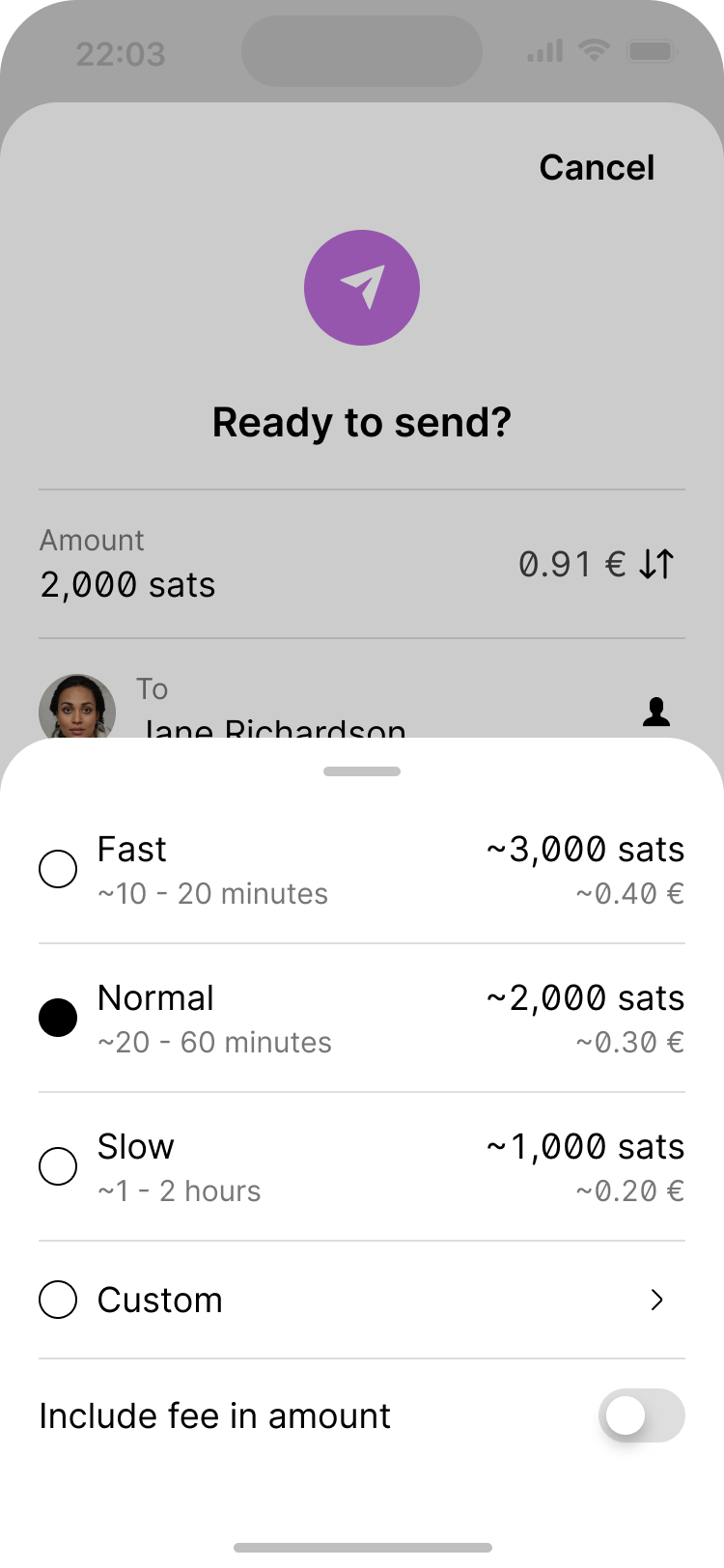
A simple framework for on-chain fees is how urgent the transaction is.
Don't
Hide the fee until after Send, or default to a high rate with no warning when the fee is half the payment. Users overpay on-chain fees by mistake more often than they underpay on purpose.
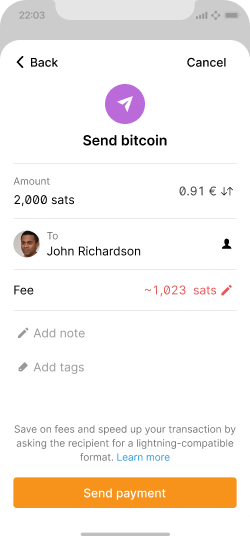
A practical warning threshold from the Guide: if the fee is about 50% or more of the transaction value, tell the user before they confirm. You can pick a different threshold, but you should pick one.
Lightning fees need the same honesty. A routing fee of a few satoshis can sit beside an LSP or swap fee that is much larger. Break them out, and let the user open a one-line explanation.
Check your understanding
1. What should an on-chain fee picker show before the user confirms?
- A. Only a sat/vB number
- B. A few urgency-based options with total cost and estimated confirmation time
- C. The current bitcoin price in USD
- D. The miner’s IP address
Answer
**B.** Cost and time are the decision the user is actually making. Raw sat/vB is optional extra, not a replacement.2. When should you warn that a fee may be too high?
- A. Never — the market is always right
- B. When the fee is a large share of the amount being sent (the Guide’s example is about 50% or more)
- C. Only on lightning payments
- D. Only if the user has enabled developer mode
Answer
**B.** The Guide’s benchmark is a warning when the fee is 50% or more of the transaction value. Tune the number if you have a reason, but do not skip the warning.What to do next
You now have three patterns you can apply, critique, or design against:
- Confirm backups by tapping numbered words, not by typing the phrase
- Format addresses so they can be compared, not just copied
- Show fees as a decision (cost + time), with a high-fee warning
If you want more depth, continue with:
- Learning bootcamp — four weeks of reading and challenges
- Design challenges — timed take-home exercises
- Daily spending wallet — the reference flows these patterns come from
To discuss this Plan ₿ draft, use GitHub issue #1163 or the #education channel on Discord.